Quick dive into Salesforce Dashboards and Reports
Once your data is imported into Salesforce, it’s time to put the platform’s powerful suite of reporting tools to work!
Whether it’s identifying prospects for a daily call list, analyzing results over a certain period of time or guiding your organisation’s strategy, Salesforce reporting tools can provide the insight your team depends on to take confident action.
As a Salesforce Administrator, your role is to translate their questions into the report or dashboard they need. It sounds daunting and can appear complicated if you’re new to Salesforce Reports but fear not.
In this quick dive we’ve pulled together all you need to know about Salesforce Dashboards and Reports, and how to create customized and dynamic ones for your company.
What are Dashboards and Reports?
Trailhead describes a report as a list of records that meet the criteria you define. In Salesforce it’s displayed in rows and columns, and can be filtered, grouped, or displayed in a graphical chart.
Dashboards take these lists of key metrics and help you visually understand changing business conditions so you can make decisions based on the real-time data you’ve gathered with reports.
You can use dashboards to help users identify trends, sort out quantities, and measure the impact of their activities.
System Requirements and Limitations
If you experience slow load times or sluggish interactions with reports and dashboards, check that your network and device meet the minimum recommended technical requirements.
Reports and Dashboards are available in:
Salesforce Classic (not available in all orgs) and Lightning Experience
Essentials, Group, Professional, Enterprise, Performance, Unlimited, and Developer Editions
Enhanced Folder Sharing and Legacy Folder Sharing
How to build a Dashboard
Dashboards are built with source reports, filters, and components.
Source reports provide data for components. You can create source reports in the Report Builder.
Filters let dashboard readers scope the data they see in the dashboard to a particular view.
Components are the visual “blocks” of a dashboard. Each component is either a chart, gauge, metric, or table;
Dynamic Dashboards
Trailhead describes Dynamic Dashboards as dashboards where the running user is always the logged-in user.
This way, each user sees the dashboard according to his or her own access level. If you’re concerned about too much access, dynamic dashboards might be the way to go.
The four types of Reports you need to know about
Summary
Most used to show multiple groups of data. They can be useful to provide insight on the popularity or profitability of your products or services
Tabular
Simple and primarily used to prepare data for exporting as a simple list, such as a mailing list, or one with a grand total. These reports won’t allow you to manipulate or interact with the data.
Matrix
Provide detailed reports in grid format, giving you the ability to group data by columns and rows, and add charts, which is useful for reviewing sales breakdowns and revenue totals.
Matrix reports can also be used to generate dashboards.
Joined Reports
Comparing data from up to five reports. While these reports provide valuable insights on specific accounts, because they are sourced from multiple reports, they cannot be used as dashboards.
How to create a Report
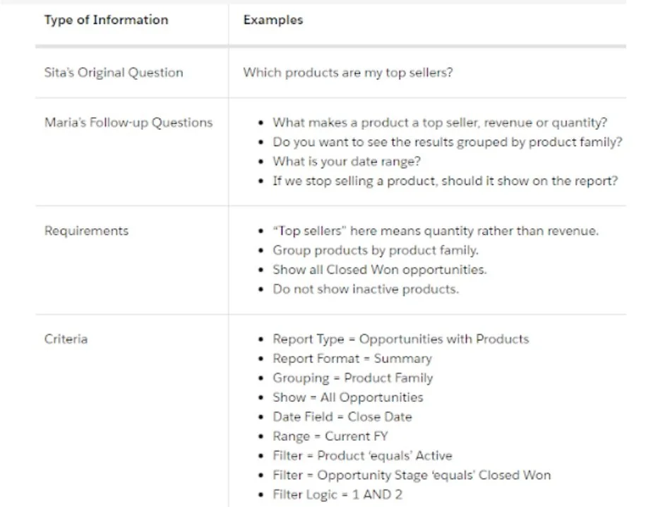
Trailhead suggests building reports in steps. First, starting with the question you’re pulling data to answer, asking follow-up questions, writing requirements, then mapping those requirements to report criteria.
Using an example of a CEO who came to her Salesford Administrator with questions about how the business was doing; specifically, which products were top sellers;
If you need tutoring or custom solutions for your organisation, we are here to help.


